Three of my pieces (Self-Portrait, Race Cube, Crayola Monologues) were included in the group exhibit "Embracing Ambiguity: Faces of the Future" at the Cal State Fullerton Main Art Gallery from January 30 to March 3.
Tag: arts
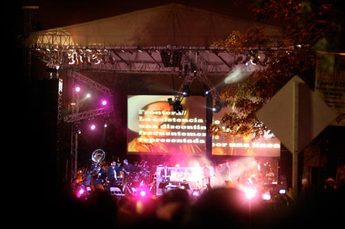
La Orquesta de Baja California joined forces with Nortec Collective artists Bostich and Fussible on Sunday for a free concert in the plaza outside Tijuana’s cultural center. It was the final day of Entijuanarte, a three-day contemporary art festival featuring work ranging from painting and photography to digital and performance arts.
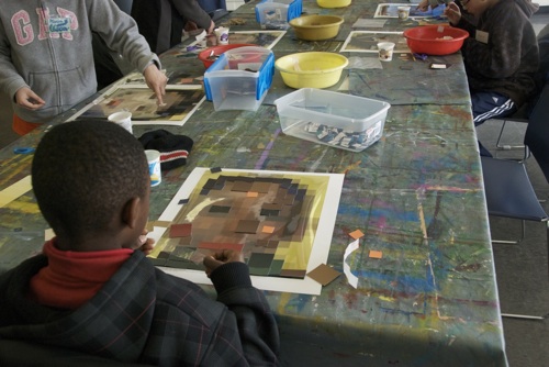
Justine Bursoni is a graduate student in art education at the University of Illinois Urbana-Champaign and an editor for the online magazine Smile Politely. She came across my Self-Portrait art piece online and wanted to include it in a lesson plan for a group of fifth and sixth grade students. She asked how I created my piece, and after giving her some tips, she had her students create their own paint swatch portraits.
“During the lesson,” Justine wrote in email, “the students were quick to note how identity comes in different forms, parts of identity can be shared… but mostly, one’s identity is unique and multi-faceted and how all should be recognized and tolerated.” It’s humbling to have my work aid that learning process, and even more humbling to be included in the list of self-portraits she used in her lesson plan:
- Charis Tsevis, “Barack Obama†(2008)
- Chuck Close, “Self-Portrait†(2007)
- Michael Mapes, “Poor Boy Michael Strange†(2006)
- Nathan Gibbs, “Self-Portrait†(2002)
- Grammy Posters (2009)
- David Hockney, “Mother I, Yorkshire Moors†(1985)
- Paul Klee “Senecio†(1922)
I also want to thank Justine for allowing me to post her PowerPoint presentation and lesson plan. The PowerPoint notes include her comments on the students’ reactions:
In the vein of open collaboration and online sharing, I put together some notes from our email conversation to provide a list of steps to help others create their own pixelated portraits.
How to Build a Portrait Out of Square Blocks of Color
In my case, I used Photoshop to create a reference image first. For best results, choose an image where the face has a solid color background. You’ll want to follow these steps in Photoshop to get the right result. These steps assume you’re printing the reference image on a standard 8.5×11 inch sheet of paper.
Photoshop Instructions
- Open and Crop: Open your image in Photoshop. Using the Crop Tool, crop it down to just the face. For this exercise, hold the Shift key while using the Crop Tool to make the crop a perfect square.
- Reduce to Pixels: Go to Image Size (on the top menu, Image > Image Size). Under Pixel Dimensions, change the units to “pixels” and adjust the width and height to 8 for both. This will end up giving you an 8×8 grid of one-inch squares. Important: Make sure the check boxes for both Resample Image and Constrain Proportions are checked. Select OK.
- Set Document Size: Your image is now 8×8 pixels. But you still need to make a second adjustment to the image settings before it can be printed correctly. Go to Image Size once more. Important: Uncheck the Resample Image check box. Under Document Size, set the units to “inches,” type in 8 for width and 8 for height. Select OK.
- Print: Everything is done and you’re ready to print. From the File menu, select Print :)
The final step in creating your pixelated portrait depends on your eye to match the colors. One tip I can offer is that the “value” or black and white levels of each color are more important to recognizing the final image than the “hue” of the color itself. For people to recognize the original image, it’s more important that it have the right amount of contrast than perfectly matching the nuances of each color.
If you do use this process to make your own, I’d love to see your project. If you have a place to upload images, post a link and describe your project here in the comments. Otherwise, send me a note and I can help you post it online.
Special thanks again to Justine for allowing me to publish her class materials and for sending the photo. Seeing that image of them working on their self-portraits puts a huge smile on my face. It’s truly rewarding to see an idea I had almost seven years ago come back to life in the hands of these young minds.
During 2004/2005, I spent my mornings waiting in line at the border. The commute from Tijuana to San Diego gave me plenty of time to watch, listen and think. For several weeks, I watched a group of men working behind a shroud of old vinyl banners and recycled plastic sheets. I couldn’t see what it was, but they were building something. Every day, I’d catch a glimpse of color or a peculiar shape. On days when traffic moved quickly, I felt a little disappointed that I hadn’t been able to see more. Day by day, the anticipation grew.
Finally, it was revealed.
The structure stands around 40-feet-tall. The base holds an imprisoned hand; the top, a tile mosaic cityscape with two spires reaching upward. Four engraved Mayan hoops face north, south, east and west. A south-facing plaque reads:
“ENTRE VENTANA Y PUERTA”
DEL ARTISTA VISUAL
OSCAR ORTEGA
Sculpture “Between a Window and a Door” By Visual Artist Oscar Ortega
At the time, I was the technical director for KPBS Radio’s The Lounge, a daily talk show covering the arts in San Diego. The show’s producer, Angela Carone, and host, Dirk Sutro, were interested in Tijuana artists as well, so I made contact with Oscar Ortega. We started an email conversation, but unfortunately, there was turnover at work and I was reassigned to a different program. After not receiving Oscar’s reply to a set of questions — and with the changes at work — the story faded into that quiet place where memories go to gather dust.
Oscar Ortega has several public pieces in Tijuana, including a mural just a short distance from the sculpture. Unfortunately, he doesn’t have an online portfolio that I can find. Searching “entre ventana y puerta” returns an image of mine on Flickr as the top result (I’m curious if this blog post will take it’s spot after it gets crawled). So after two years waiting to read someone else’s review of the piece, I figure it’s about time to share my own.
He explained the title as a description of Tijuana’s physical (and perhaps psychological) situation. It’s an incredibly transited city, but has no seaport, making its coastline only a “window.” The “door” refers to the U.S. border — a door locked for many. The piece, like the city, is rich with layered symbols: the hand of Mexican labor, cars circle the base endlessly, the round indigenous blocks carved with the men’s bathroom figure, the jumbled mosaic like the residential architecture covering Tijuana’s hillsides.
Certain patterns line up at particular angles, allowing you to discover each scene as you move around it. For me, Ortega’s sculpture stands as a monument to the culture of Tijuana: a mix of indigenous and modern symbols, a city of travelers, glimpses of family struggle, international labor and commerce, and all of it trapped in a corner at the edge of the world. And I’m curious if the people who pass “between a window and a door” daily manage to see themselves in it.

